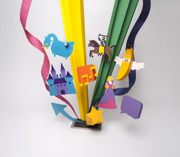
WER LIEFERT WAS offers a professional and free of charge product and service provider search as an effective alternative to the usual search engines, promising users ‘find what you’re really looking for’. They took a funny approach to their multi media brand campaign, appealing to their users’ sense of humour, playing on words that had been misunderstood or taken literally by other search engines. VCCP Berlin commissioned Australian illustrator Carolyn RIDSDALE to help create the illustrated subjects. And animation specialist Jurg NEVE c/o ARTBOX transformed the illustrations into animated spots. ‘The campaign idea behind ‘find what you’re really looking for’ doesn’t just promote our USP, it also harmonises our corporate claim of ‘the expert search engine’, says Doreen Schlicht, Director Marketing/PR.
"Ever felt like the king of your own small world? Well, we’ve been feeling like that ever since we’ve created this worldmap for ING together with Ars THANEA and our designers at ARTBOX," the Amsterdam agency for illustration and animation comments on the current work for ING. The illustrated map of the world was used as the cover of ING MAGAZINE, with more uses to follow soon.
Illustrator Pepijn BERGHOUT produced the bold key visual for this year’s SpinAwards 2014. In addition Artbox took care of the event’s full image, from the poster to animation. The latter will be on show at SpinAwards Night. See you there! spinawards.nl
If you want to win an exciting trip to Rio, then you can soon play with the super musical samba machine, which animator Jurg NEVE created for CHIO. "With Chio to Rio!" chio.de
PARKER is celebrating its 125th anniversary with a key visual, illustrated by Ger VENDEL for worldwide use in print and outdoor media. Artbox tells GoSee: "In 1888 George Safford Parker literally wrote history with an innovation that until then seemed impossible: a non-leaking ink pen! On the occasion of 125 years Parker, our creatives designed a key visual, commissioned by Saatchi & Saatchi Geneva, that summarizes the company’s rich history of craftsmanship and innovation in one image.
This key visual—that appeared worldwide in print and outdoor media—unites various creative powers. Rhonald Blommestijn created the people in the picture. He dressed himself in historical clothing, took his own picture, which he finally illustrated. Photographer Fulco Smit Roeters shot the pen’s pack shots, onto which Jurg Neve attached a 3D construction system. Eventually image manipulator Ger Vendel integrated the various elements of pack shots, 3D and photography.
The pen depicts both a timeline and the workplace of different characters; workers, designers, office clerks. On the left hand side—around 1890— it is still under construction. Moving to the right, the pen, its users and their working methods become increasingly modern. Meanwhile, Parker himself peeks into the future through a telescope."
And this summer the boards are back on the asphalt. Andreas PREIS designed prints for the new LAND YACHTZ Longboard Collection. More of his designs, also for skater wear are available at landyachtz.com.